Power BI Reports - advantages and alternatives at a glance
Power BI has already captured a significant market share. Numerous companies have already benefited from better data analysis and decision-making thanks to the interactive reports. But although many companies are convinced of the benefits and results, it takes a lot of experience and time to create and customize Power BI reports. We show you the advantages, alternatives and tips at a glance:
What are Power BI reports and what are they for?
Power BI is a data visualization tool and is offered as part of the Microsoft 365 subscription. With Power BI reports, company data can be presented clearly and comprehensibly in graphs, charts and tables. Imagine how much data your company has. For example, your turnover and cost figures as well as data on your products, customer preferences and customer demand. Power BI reports allow you to visualize all these figures so that everyone, both the team and the boardroom, can quickly understand the information and base their decisions on it.
What sounds good is unfortunately still a long way off in some companies. The process of data analysis is often as follows: static Excel reports are created every month, which are then sent around the company by email and presented at meetings. The catch: tomorrow your reports may already be out of date and you have lost valuable time for creating and updating them, which you could have spent on more important tasks.
Power BI reports, on the other hand, are interactive data reports for companies that update themselves. This means that you create a one-off report with the data you want. The report changes according to your data and therefore always shows the most up-to-date figures.

Why are Power BI Reports so popular?
Power BI reports are an easy and cost-effective way for you to get started with BI. You can interact with your reports and run through different planning scenarios. You can perform complex calculations and forecasts based on your data.
In terms of holistic controlling, companies gain transparency with Power BI. All the data that you collect in the company can be visualized and evaluated across all departments. This creates a solid basis for holistic strategic decisions.
The following overview shows what else the interactive reports have to offer:
Real-time analyses on all end devices
Regardless of the device, location and time from which you access your reports. Your data is transferred to the BI tool in an agile manner via interfaces to your databases, which means that your analyses are always up to date.
Create and share reports
Drag & drop functions allow you to create your reports intuitively and independently. They can also be easily shared and presented on all end devices.
Access to Power BI reports via a central self-service platform
No more searching through different data sources, because your reports are displayed in one place and can therefore be found by the entire company. Sending reports by e-mail is also a thing of the past.
Flexible data connection
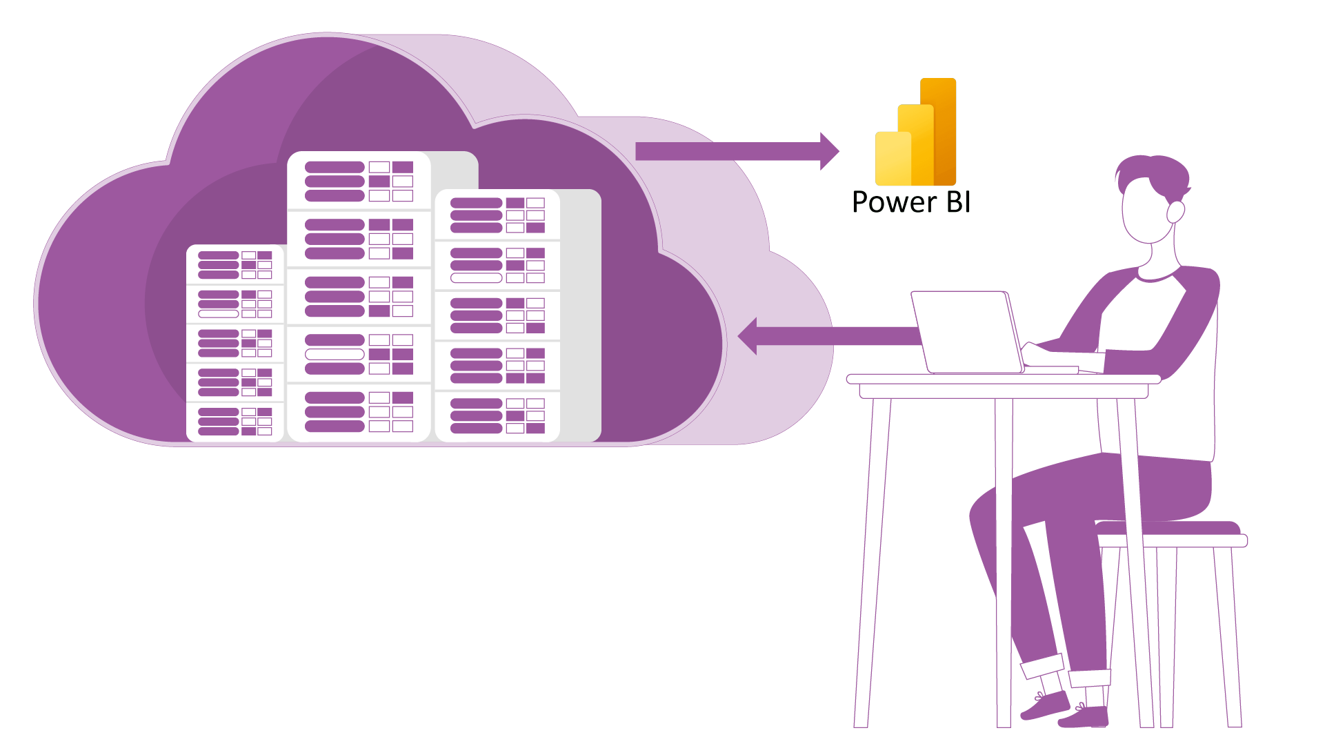
With Power BI, your reports can be connected to various data sources such as databases, CRM and ERP systems, local CSV or Excel files, SQL, Oracle, SAP and web services.

Classic challenges with Power BI
Lack of resources
It is true that Power BI reports are a great help for companies that want to view and control their business processes and operate successfully. However, what is also becoming apparent is that companies sometimes find it difficult to create their own reports:
Company data is becoming increasingly complex and creating a report in Power BI implies knowing which metrics and data format you need and how to make your figures appealing and meaningful. Not to mention that you need staff or even a BI team that has spent some time learning Power BI. In addition, coordination with other departments is also required so that cross-departmental company reports can be created in the shortest possible time and lead to holistic measures. Not all companies have the capacity for this.
Power BI is not a planning tool
If you want to check your actual data against your target values in Power BI, it’s not that easy. To compare target and actual values line by line, you need DAX knowledge and knowledge of matrix visualizations. In addition - depending on the desired functions - further licenses. With the right planning software that offers its own reporting dashboards and is connected to BI, data analysis is child’s play and effectively accelerates your decisions and measures.
What alternatives are there to Power BI Reports?
As already indicated, Power BI reports are not suitable for all companies. So before you start spending money and effort on creating your own Power BI reports, you should ask whether the software solution you use to prepare your data also has its own reporting dashboards and reports.
Some planning tools, such as QVANTUM, already offer preconfigured reporting dashboards that are geared towards the needs of the departments and functions in the company. Interactive reports can be created with just a few clicks. The data is based on a customized dashboard that combines the key figures that are important to you. The dashboards can be connected to Power BI via an interface, allowing you to use all the functions that Power BI offers you. With the decisive advantage that you do not have to create and set up your dashboards and reports completely yourself thanks to the templates. This saves considerable time and costs.
In addition, your software already offers a central location where you can collect, store and correlate all your company figures. Everything you plan and display in your software (e.g. cost overview, target/actual comparison) is translated one-to-one into your reporting dashboard so that anyone who is not involved can immediately understand how your company’s figures are doing.

How to create quick reports without Power BI know-how
1. collect and prepare data
First of all, you need all the data you want to display in your report. To ensure that this is correct and always up-to-date, we recommend preparing the data in cloud-based software. Here, data is collected centrally, automatically merged and displayed in real time so that you don’t have to search for it.
2. buy standard dashboards
Opt for software that offers ready-made standard dashboards for data analysis. QVANTUM offers ready-made dashboards specifically for your personnel cost planning, investment planning, sales and revenue planning, HR and cost center planning, which generate interactive reports just like Power BI.
3. connect to Power BI
Your data from the software can be connected to Power BI via an interface and displayed in your standard dashboards. Power BI is usually included in your Microsoft 365 license. So all you need is the planning software with the corresponding dashboards and the interface to Power BI.
4. data is imported automatically
The data from your planning is automatically transferred to the finished dashboards via the interface and displayed transparently thanks to Power BI’s visualization options.
5. reports are created
Based on the key figures in your dashboard, reports are created that can be updated and shared with your team on all devices thanks to the connection to Power BI.
Our support team will be happy to offer you free advice on which preconfigured dashboards are suitable for your company and how you can effectively prepare and visualize your data in software such as QVANTUM.